
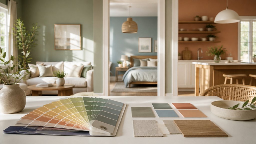

A paint swatch can look like a quiet mist at noon and a storm cloud by evening. That’s why choosing colours for your home takes more than picking a shade you like: you need to take into account each room’s light, purpose, furnishings, and finish. Test samples where you’ll use them, then compare how they shift throughout the day. The right approach can make every room feel more inviting—but one common mistake can undermine even the best colour choice.
Match Paint Colours to Light and Finishes
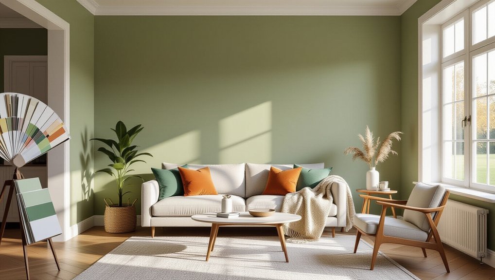
Before you choose a paint colour, check how the room’s natural and artificial light affects it. Observe your walls in morning, afternoon, and evening light, since changing conditions can shift undertones and brightness. Test sample patches on different walls, then view them beside your flooring, cabinetry, and textiles. Don’t rely on a small chip; larger samples reveal how a shade behaves across the room.
Your surfaces matter, too. Compare paint finish options against each wall’s condition and use. Matte finishes soften minor flaws, while eggshell and satin offer greater durability and easier cleaning. Semi-gloss suits trim and high-contact areas, but its sheen can highlight uneven surfaces.
For Accent wall ideas, assess how light falls across the feature wall before choosing a contrasting colour or finish. Confirm samples under your actual bulbs, because warm and cool lighting can change their appearance.
Choose Paint Colours for the Mood You Want
Choose paint colours by considering how you want a room to feel and function. Color psychology can guide your choices, but your preferences and daily routines matter just as much.
For a bedroom, consider muted blues, greens, or warm neutrals to support a restful atmosphere.
In a kitchen or workspace, clearer, brighter hues can feel energizing and encourage activity.
If you want a living room to feel welcoming, choose warm undertones; cooler shades can create a more composed setting.
Think about the emotional impact of colour, too: saturated tones may feel lively or intense, while softened versions often feel calmer.
Match the colour’s strength to the room’s purpose and the mood you want to sustain.
You don’t need to follow trends; choose a palette that feels comfortable and suits how you use the space.
Test Paint Samples in Your Room
Paint large sample areas so you can judge each colour across the room.
Check them at different times of day, since changing light can shift how they look.
Compare nearby shades to see which one works best with your furnishings and finishes.
Paint Large Sample Areas
Once you’ve narrowed your options, test each colour on a large patch of wall in the room you plan to paint. A generous sample size—at least 30 by 30 centimetres—shows the colour more accurately than a small chip and helps you judge how it works with nearby finishes.
Use proper paint application: prepare the surface, apply two coats, and let each coat dry as directed.
If you’re comparing several shades, paint separate patches with space between them, or use large, movable sample boards. Keep each test area on the same wall so you can make a fair comparison.
Label every patch with the paint name and finish, and record your impressions.
Don’t rely on tiny swatches; they can make subtle differences difficult to distinguish and lead to costly repainting.
Observe Changing Light
As the light shifts throughout the day, the same paint colour can look warmer, cooler, brighter, or darker. Leave your large samples in place for at least a full day, and check them at several times: morning, midday, late afternoon, and evening.
Natural light changes in intensity and direction, so notice how each wall responds rather than judging by one sunny moment. Also assess the colour under artificial lighting after dark. Turn on the lamps and overhead fixtures you normally use; warm bulbs can bring out yellow or red undertones, while cooler bulbs may make a shade appear sharper.
If you’re choosing paint for a room with limited daylight, give its evening appearance extra weight. Record your impressions, and make your decision only after seeing the sample through the room’s usual lighting conditions.
Compare Nearby Colours
To compare nearby colours accurately, place large samples side by side on the same wall so you can judge their undertones and differences in brightness under identical conditions. Keep samples at least 30 centimetres wide; small chips can hide subtle shifts. View them in morning, afternoon, and evening light, and check how they look beside flooring, furniture, and trim.
Don’t rely on memory: label each sample and note which one feels warmer, cooler, lighter, or more muted. If two shades seem nearly identical, choose the one that better supports your room’s mood and existing finishes.
Complementary colour schemes can help you assess how a wall colour relates to accents, while colour contrast techniques reveal whether furnishings stand out or blend in. Live with your samples for several days before deciding.
Pick Calming Paint Colours for Bedrooms
Soft blues, muted greens, and warm neutrals can make a bedroom feel more restful. Choose a shade that supports the mood you want, then test it in your room before committing.
Muted blues can feel quiet and cool, while soft greens bring a gentle, natural quality. If you prefer warmth, consider a subdued beige or pale taupe rather than a stark white.
Check samples at different times of day, since daylight and lamplight can change how a colour appears. Paint a large test area, and view it beside your bedding, flooring, and furniture. These existing finishes can make the same paint look warmer or cooler.
For a cohesive result, keep the walls soft and restrained, then use deeper tones in small accents. Choose a finish that suits your walls; eggshell offers subtle sheen and easy cleaning.
Choose Welcoming Colours for Living Rooms and Kitchens
Choose warm living room hues, such as soft terracotta or golden beige, to create a comfortable space for gathering.
In the kitchen, inviting colours like muted sage or creamy white can feel fresh and welcoming.
Test samples in your lighting before you commit, since natural and artificial light can shift how each colour looks.
Warm Living Room Hues
Warm paint colours make living rooms and kitchens feel inviting without sacrificing style. In your living room, consider soft terracotta, muted ochre, or warm greige; these shades add depth while remaining easy to live with. Test samples on different walls, since daylight and evening lamps can shift their appearance.
Use colour psychology principles to guide your choice: earthy reds and golds can feel energising, while creamy neutrals create a calmer backdrop. For Accent wall ideas, paint a fireplace wall or alcove a deeper version of your main shade, then repeat that colour in cushions or artwork.
Balance warm paint with natural wood, textured fabrics, and cooler accents such as blue or green. Choose a finish suited to the room’s use: washable eggshell handles everyday marks better than flat paint.
Inviting Kitchen Colours
Because kitchens often serve as gathering spaces, welcoming colours should feel inviting while working with your cabinets, counters, and natural light. Start by evaluating these fixed features before choosing paint. Warm whites, soft greiges, and muted greens create a comfortable backdrop without competing with busy surfaces.
If your kitchen receives limited daylight, choose a lighter shade with a warm undertone to keep it from feeling stark. In a sunlit room, deeper hues can add character while maintaining a relaxed mood.
Test sample patches at different times of day, since changing light can shift how each colour appears. Use cozy kitchen accents, such as wood, textiles, or brass, to reinforce warmth.
For a bolder look, pair restrained wall paint with vibrant backsplash colours, keeping the overall palette balanced and easy to live with.
Select Durable Colours for Bathrooms and Hallways
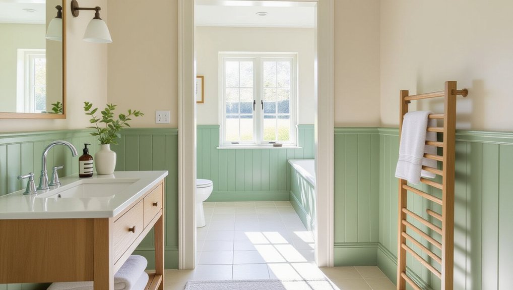
How can you keep a bathroom or hallway looking fresh despite moisture, scuffs, and frequent cleaning? Choose colour and paint finish with durability in mind.
In bathrooms, moisture resistant paints help protect walls from humidity, while satin or semi-gloss finishes wipe clean more easily than flat paint. Use an extractor fan to reduce condensation and extend the finish’s life.
Hallways need to withstand bags, hands, and everyday knocks. Mid-tone colours can disguise minor marks better than very pale shades, and stain proof finishes make routine cleaning simpler.
Test your chosen colour in the actual space: narrow halls may feel brighter with light shades, while darker tones can add depth if lighting is strong.
Before painting, clean surfaces, repair damage, and apply a suitable primer. These steps help your colour stay attractive longer.
Conclusion
The right paint colour doesn’t just cover a wall—it changes how your home feels. You’ve considered light, mood, samples, and the demands of each room; now trust what you’ve observed. Before you commit, look once more at your test patches in morning and evening light. One shade may suddenly feel too cool, while another makes the room come alive. Choose the colour that feels right in every moment, prepare the surface well, and your home’s transformation can begin.