
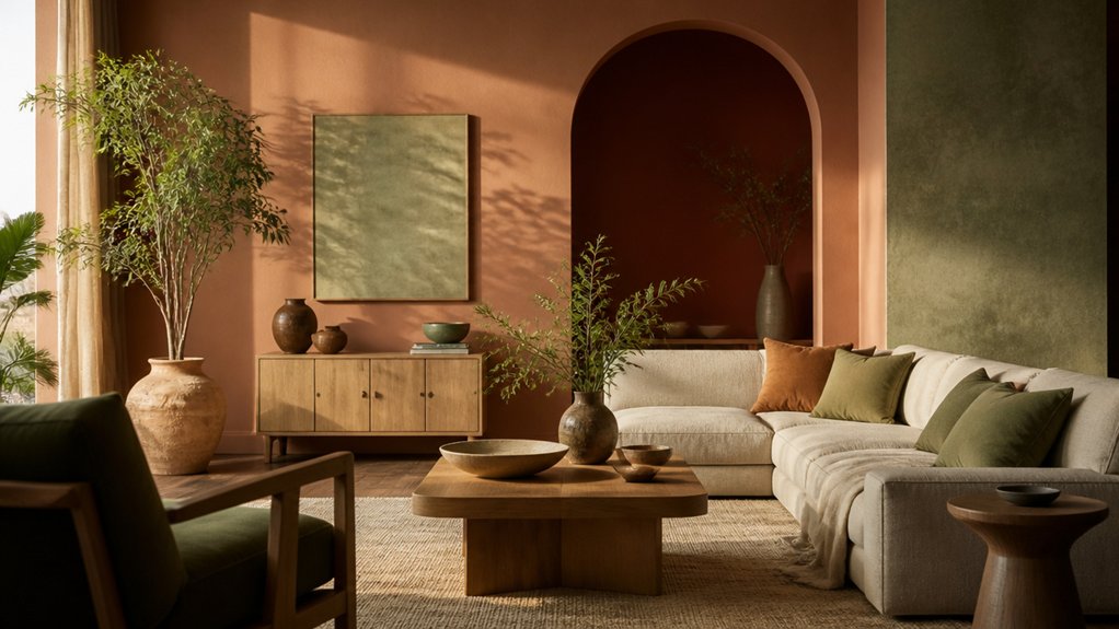

Just as natural materials are returning to modern interiors, earthy paint colours are gaining ground in homes that once leaned on cool neutrals. You can use clay, olive, beige, and terracotta to soften clean lines without sacrificing a contemporary feel. The right shade also depends on your room’s light, finishes, and layout. Before choosing a colour, consider which undertones will bring warmth without making the space feel smaller.
Why Earthy Paint Colours Feel at Home
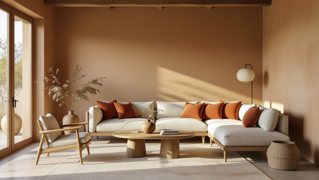
Earthy paint colours feel at home because they echo the natural materials and muted tones people already trust—think clay, stone, moss and timber. That familiarity helps you create rooms that feel grounded rather than overly styled.
Earthy paint colours evoke comfort by softening hard edges and making everyday spaces feel more welcoming. They also offer timeless appeal: unlike high-impact trend shades, these hues work with changing furniture, finishes and personal tastes.
For you, that means less pressure to redecorate when fashions shift, and more value from each investment in paint and furnishings. Their subtle depth can make a home feel considered without demanding a full renovation.
In a market where buyers often favour warmth and versatility, earthy tones can help your rooms feel both current and easy to imagine living in.
Choose Earthy Paint by Undertone and Room
To choose earthy paint with confidence, look beyond the colour name and check its undertone in your room’s light. A green-based brown can feel calm in a north-facing study, while a red-based neutral may add balance to a sunlit living room. Test large samples on more than one wall, then observe them morning, afternoon, and evening; daylight and warm bulbs can shift the result.
Match depth to the room’s purpose and size. Muted, lighter shades keep compact spaces open, while deeper tones can make a dining room feel more intimate. Consider existing floors, cabinetry, and upholstery before committing, since these fixed finishes shape how paint reads.
Choosing complementary accents in wood, metal, or textiles helps the palette feel deliberate. For connected rooms, try experimenting with color gradients to create flow without making every wall identical.
Soft Clay Paint Adds Gentle Warmth
Soft clay paint brings warmth to a room without the intensity of terracotta or rust. Its muted blush and beige undertones soften clean-lined interiors, making it a smart choice when you want character without a bold colour commitment.
Use it on all four walls for a welcoming living room, or reserve it for a bedroom alcove to define a restful zone. Check samples in morning and evening light; clay shades can shift noticeably as the day changes.
For an authentic finish, ask suppliers about Natural clay techniques and Organic pigment blending, which can create nuanced colour and a tactile surface. Pair soft clay with warm white trim, natural timber, or brushed brass for a polished scheme.
Choose washable matte paint in busy spaces to keep maintenance practical and the finish consistent.
Muted Olive Paint Brings Nature Indoors
Muted olive paint brings a grounded, natural feel while staying more restrained than deep forest green. Use it to add colour without overwhelming a room, especially where you want warmth and visual depth.
In a north-facing space, test a sample first: cooler light can make olive appear greyer, while warm bulbs bring out its softer, yellow undertones.
Pair the shade with timber, linen, or brushed brass for a considered finish that feels current rather than rustic. It also gives an indoor garden a cohesive backdrop, making leafy plants stand out without competing for attention.
For nature-inspired decor, repeat olive in cushions or artwork, but keep larger furnishings neutral to protect flexibility. This balanced approach lets you refresh the room affordably while choosing a colour with enduring appeal.
Sandy Beige Paint Creates a Calm Base
When you want warmth without a strong colour statement, sandy beige paint gives walls a calm, versatile base. This neutral works hard in rooms where you want flexibility: it complements timber, stone, linen and contemporary furniture without competing for attention.
Choose a shade with a subtle warm undertone to keep north-facing spaces from feeling flat, and test samples on different walls before committing; daylight and artificial lighting can shift the colour noticeably.
Sandy beige also makes future updates easier. You can refresh cushions, rugs or artwork without repainting, helping your scheme adapt as tastes change.
For a cohesive finish, carry the colour through connected spaces, then vary texture with matte walls, natural fibres and polished accents. The result is a Calm base that feels considered, welcoming and commercially sensible—a reliable choice if you’re balancing longevity with broad appeal.
Rich Terracotta Paint Makes a Statement
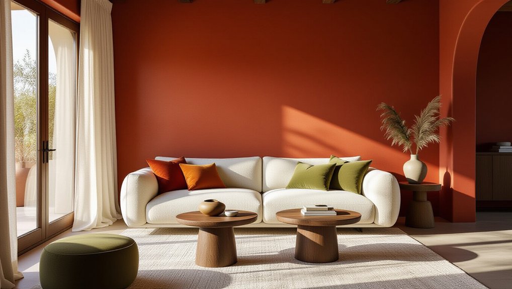
For a warmer, more expressive interior, rich terracotta paint brings earthy depth and a confident focal point. Use it on a feature wall, built-in shelving, or a compact dining nook to add character without overwhelming your scheme.
If you’re updating a larger room, balance terracotta with the sandy beige already in your palette; the softer neutral keeps the bold shade approachable and helps you avoid costly, short-lived trends.
Texture contrast makes the finish feel considered: pair matte walls with smooth timber, woven upholstery, or brushed metal.
For color pairing, choose cream, olive, or muted blue accents, then repeat one tone in cushions or artwork for cohesion.
You don’t need a full redesign; paint can refresh existing furniture or architectural details, giving your home a distinctive look with a manageable investment.
Match Earthy Paint Colours to Room Light
Room light can shift earthy paint colours from soft and grounded to unexpectedly intense, so test samples on each wall before committing. Observe them morning, afternoon and evening; daylight changes direction and strength, while warm bulbs can deepen reds and browns.
North-facing rooms often benefit from warmer clay, ochre or muted rust, while strong southern exposure can handle cooler olive or stone shades. These Lighting effects matter because a colour that sells well on a swatch may look flat or overly saturated at home.
Check samples beside windows and under your actual bulbs, then compare them with your flooring and furnishings. Choose the finish for the room’s use, too: kitchens and hallways need washable paint durability, while low-traffic bedrooms can suit a softer matte finish.
Confirm the product’s cleaning guidance before buying.
Pair Earthy Paint With Wood and Natural Textures
Pair earthy paint with varied wood tones to add depth without making your room feel busy. You can balance warm walls with lighter oak, richer walnut, or a mix of both.
Add natural textures like linen, jute, and woven baskets to make the palette feel layered and lived-in.
Layer Wood Tones
Earthy paint feels most inviting when you layer it with wood tones and natural textures. Start with one dominant wood finish, such as oak flooring or walnut cabinetry, then introduce a lighter or darker tone through furniture. This controlled contrast adds depth without making your room feel busy.
Let the paint guide your choices: olive walls pair well with warm oak, while clay shades complement deeper walnut. Pay attention to undertones, since yellow, red, or gray notes can make finishes clash.
Wood grain brings natural variation, so compare samples in your room’s actual light before committing. Natural finishes keep the palette grounded and help your investment feel lasting rather than trend-led.
Repeat each wood tone at least twice, perhaps in a table and frame, to create cohesion and make the scheme feel intentional.
Add Natural Textures
To keep earthy paint from feeling flat, bring in natural textures that add depth without competing for attention. Pair clay, olive, or warm beige walls with linen curtains, jute rugs, and woven baskets. These natural fiber accents soften crisp edges and make a room feel considered, not overstyled. Choose pieces with visible variation; subtle irregularities look richer than matching, machine-perfect sets.
For added character, consider textured wall finishes such as limewash or fine plaster. Their gentle movement catches changing light, giving muted colours dimension without demanding a bold pattern. Balance rough surfaces with smooth upholstery or streamlined furniture so the room stays comfortable and current.
Before committing, test finishes beside your flooring and fabrics: undertones can shift in different light. A restrained mix helps your palette feel layered, while versatile materials support a polished look that can adapt as trends evolve.
Use Earthy Paint on Walls, Trim, and Ceilings
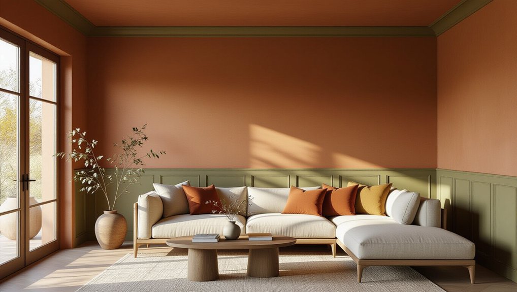
Color doesn’t have to stop at the walls: extending an earthy shade across trim or ceilings creates a cohesive, enveloping look. You can carry terracotta, olive, or warm taupe throughout a room for a tailored feel, or use a lighter ceiling shade to keep the space open.
Painting trim to match walls softens contrast and makes architectural details feel integrated; a deeper trim colour adds definition without introducing another palette.
Before you commit, test samples in morning and evening light, since earthy tones shift with exposure. Choose durable finishes for high-touch trim and a washable sheen in busy rooms.
Ask suppliers about Eco friendly pigments and low-VOC formulas to support healthier interiors. Skilled paint application techniques, including careful edging and consistent coverage, help deliver a polished result that can strengthen your home’s appeal.
Conclusion
Like a well-worn path, earthy paint colours bring a sense of ease and permanence to modern rooms. Choose clay, olive, beige, or terracotta by considering each room’s light, purpose, and existing finishes. Then test samples beside wood, stone, and textiles before committing. You’ll create a palette that feels warm without looking dated—and works across walls, trim, or ceilings. With thoughtful choices, your home can feel grounded, welcoming, and ready for whatever style comes next.