


Choosing between bold and neutral paint starts with how you want a room to feel and function. Bold colours can add energy and focus, while neutrals create a quieter backdrop for furniture and decor. Light, room size, and existing finishes also affect how each shade looks once it’s on the wall. Before you choose, consider where each approach works best—and what a simple sample can reveal.
How to Choose Bold or Neutral Paint
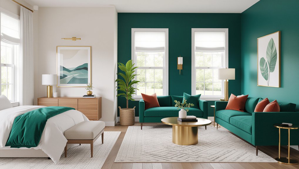
Choose bold paint when you want a room to feel energetic or to draw attention to a feature; choose neutral paint when you want a calm backdrop that’s easy to update.
Start by considering how you use the room, the mood you prefer, and how much upkeep you’ll accept.
Color psychology can guide your choice: warm, saturated shades often feel lively, while muted tones tend to feel restful.
Test samples on several walls and view them in daylight and evening light before committing.
Check paint durability, especially in kitchens, hallways, and children’s rooms; washable finishes can handle frequent cleaning.
Also consider your furnishings, flooring, and fixed finishes so the colour works with what you already own.
If you’re unsure, begin with a neutral base and add bold colour through smaller, easier-to-change details.
How Bold and Neutral Paint Change a Room
Bold paint can make a room feel more energetic, intimate, or dramatic, while neutral paint often makes it feel calmer and more open. Use this effect to support how you want to live in each space. A saturated hue can give a dining area a lively, social character, while a soft neutral can make a bedroom feel restful. Color psychology offers useful guidance, but your personal response matters most; choose shades that suit the room’s purpose and your taste.
Consider how much attention you want the walls to draw. Bold colors create a strong backdrop and can make furnishings feel more striking. Neutrals let artwork, textiles, or furniture take the lead.
Before committing, test samples and assess the finish. Good paint durability helps your chosen color withstand everyday wear and keeps the room looking cared for.
How Light and Room Size Affect Paint
The same paint color can look quite different depending on a room’s light and size. Before choosing a shade, observe how natural lighting changes throughout the day. North-facing rooms often receive cooler, weaker light, which can make colors appear muted; warmer undertones can help balance that effect.
South-facing spaces get stronger sunlight, so test samples at different hours to see whether a color becomes too intense or washed out. Artificial lighting matters, too: warm bulbs enrich reds and yellows, while cool bulbs can sharpen blues and greens.
Consider room proportions as well as brightness. Pale colors can make a compact space feel more open, while darker shades may make it feel intimate. In a large room, a mid-tone can add visual weight.
Paint a sample patch and assess it from several angles before committing.
Where Does Bold Paint Work Best?
Bold paint works best where you want to create a clear focal point or energise a room. Try an accent wall to add depth without overwhelming the space.
In social areas like living rooms and dining rooms, rich colours can make gatherings feel more inviting.
Accent Walls
Where can a bold accent wall make the biggest impact? Choose a bedroom, home office, or hallway where one strong colour can add definition without overwhelming the space.
In a bedroom, place the colour behind your bed to create a clear focal point. In an office, use it to frame your desk and support concentration. A hallway can handle a saturated shade because you pass through rather than spend hours there.
Use Color psychology to match the mood you want: deep blues feel composed, while warm terracotta adds energy. Test samples in daylight and at night before committing; changing light can shift a colour’s appearance.
Consider paint finishes, too. Matte hides minor wall flaws, while eggshell offers easier cleaning. Keep nearby walls and furnishings restrained so your accent wall feels intentional, not competing.
Social Spaces
In social spaces, bold paint works best where people gather, such as living rooms and dining areas. Choose a deep green, warm terracotta, or rich blue to give these rooms energy and a clear focal point. Consider Color psychology: warm shades can encourage conversation, while cooler tones create a composed backdrop.
Test samples in morning and evening light before committing, since natural and artificial lighting can shift a color’s appearance.
Balance saturated walls with neutral furnishings, or use a bold shade on one wall if you prefer a lighter touch. In busy rooms, check paint durability and choose a washable finish that stands up to fingerprints, scuffs, and frequent cleaning. Satin or eggshell finishes often suit high-traffic areas.
Keep adjoining spaces in mind, too; coordinated undertones help your home feel cohesive.
Where Does Neutral Paint Work Best?
Neutral paint gives your living room flexibility, making it easier to change furnishings and accents.
In the bedroom, choose soft neutrals to create a calm, restful feel.
Use a consistent neutral shade in hallways to connect adjoining rooms.
Living Room Flexibility
A neutral living room gives you room to change furniture, artwork, and textiles without repainting. Choose a warm white, soft greige, or muted taupe to create a versatile backdrop that suits your room’s natural light and existing finishes. Then introduce personality through cushions, rugs, curtains, and art—pieces you can replace as your taste shifts.
Color psychology can guide your choice: warm neutrals feel welcoming, while cooler shades create a cleaner, more spacious impression. Test paint samples on several walls, since daylight and lamps can alter their appearance.
Consider seasonal trends through removable accents rather than a full repaint; rust, green, or deep blue accessories can refresh the room while the walls stay timeless. If your furniture is bold, a restrained wall colour helps balance the space and keeps future updates simple.
Bedroom Calm
After creating a flexible living room, you can use neutral paint in the bedroom to support a calmer feel. Soft whites, muted taupes, and gentle greiges reduce visual noise without making the space feel bland. Color psychology helps explain why these restrained shades can encourage relaxation, though your lighting and furnishings also shape the mood.
Test samples on different walls and observe them in morning and evening light before choosing a finish.
For a restful scheme, pair neutral walls with layered textures, such as linen bedding, wool rugs, or natural wood. These details add warmth without demanding a stronger wall colour.
Consider paint durability when selecting a finish: eggshell or washable matte can handle routine cleaning while preserving a soft appearance.
If your bedroom gets little daylight, choose a warmer neutral to keep the room from feeling cold.
Hallway Continuity
Because hallways connect rooms, neutral paint can create a smooth shift between different colour schemes. Choose a warm white, soft greige, or muted beige that complements the adjoining rooms without competing with their colours. Test samples in your hallway’s natural and artificial light; narrow spaces can make undertones appear stronger than expected.
Color psychology matters here: pale, warm neutrals can make a dim passage feel more welcoming, while cooler shades may lend a crisp, open impression. Carry the same neutral through connected corridors for visual continuity, or use a slightly deeper tone to define a long hallway without creating a jarring break.
Prioritise paint durability in this high-traffic area. A washable finish, such as satin or eggshell, helps you remove scuffs and fingerprints. Pair it with durable trim paint to keep edges looking fresh.
How Do You Pair Paint With Furniture?
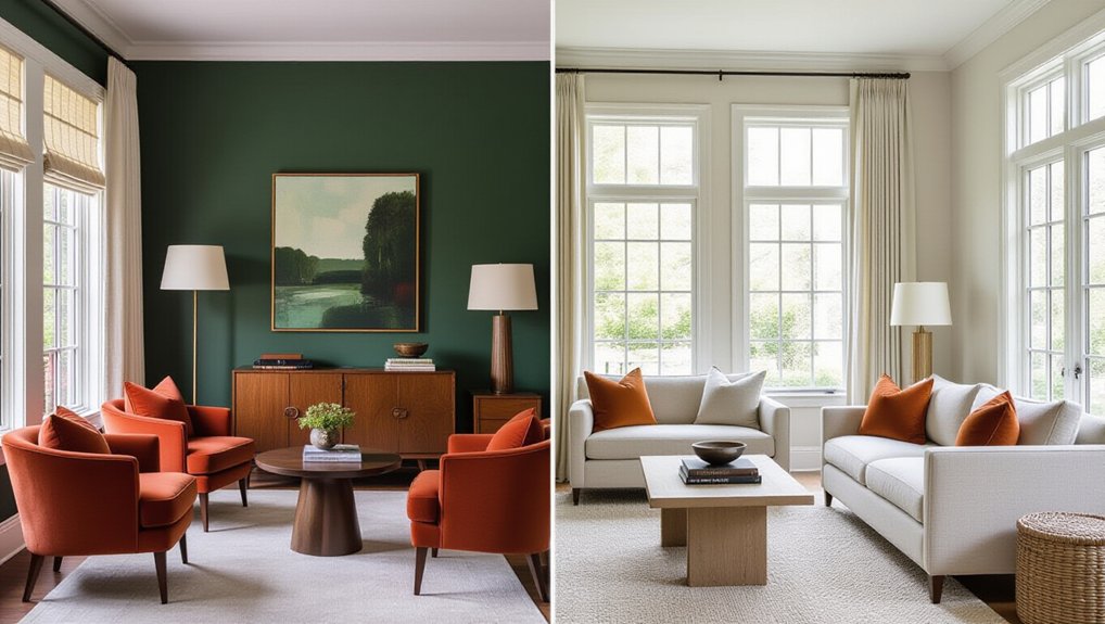
Start with the furniture you plan to keep, then choose paint that complements its colour and undertone. Warm wood, for example, pairs naturally with creamy whites, muted greens, or earthy reds; cool-toned pieces often suit crisp whites, blues, and charcoal.
Consider the room’s overall balance, too. If your sofa or cabinetry has a strong colour, let it anchor the palette and keep surrounding walls restrained. For pale or neutral furniture, deeper paint can add definition and furniture contrast without making the room feel crowded.
Repeat one or two tones from your furnishings in decorative accents, such as cushions, rugs, or artwork, to tie the scheme together. You don’t need an exact match: related shades create a more layered, intentional look.
Also account for large surfaces, including flooring and curtains, when choosing a wall colour.
How Can You Test Paint Colours First?
Before committing to a colour, test it on the walls in the room where you’ll use it. Paint large sample patches on at least two walls, including one that receives direct sunlight and one that stays shaded. Check each patch in morning, afternoon, and evening light; artificial bulbs can shift undertones, too. Don’t rely on small cards, which can make colours look different from a full wall.
Live with the samples for several days before deciding. Notice how they work with your furniture, flooring, and finishes. Consider Color psychology: a vivid shade may energize a workspace but feel overwhelming in a bedroom.
If you’re comparing finishes, test those as well. Finally, check the manufacturer’s guidance on paint durability and choose a finish suited to the room’s traffic, moisture, and cleaning needs.
Conclusion
Choose paint that suits each room’s purpose, your style, and the light it receives. Bold colours bring energy and drama; neutral shades offer calm, flexibility, and a timeless backdrop. Pair your pick with your furniture, and consider how room size affects its appearance. Before committing, test samples at different times of day. You’ll see how each shade shifts, then select a colour that feels balanced, beautiful, and right for your home. A thoughtful choice makes every room work better.