
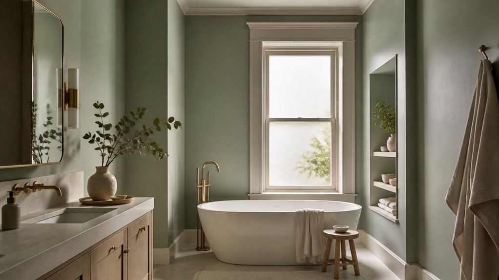

A 2023 survey found that 73% of homeowners consider a bathroom’s design important to their sense of wellbeing. You can make yours feel more restorative by choosing paint colours that soften the light and complement natural materials. Warm neutrals, muted greens, and misty blues each create a different kind of calm, but the right choice depends on your room’s lighting, finishes, and humidity. Get those details right, and even a small bathroom can feel like a spa.
The Best Spa Bathroom Paint Colours
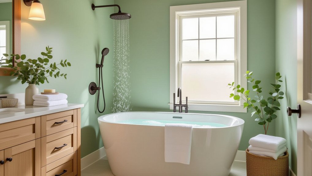
The best spa bathroom paint colours create a calm, restorative feel without making the room seem cold or sterile. Choose muted neutrals, such as warm ivory, soft taupe, or pale greige, to reflect light while adding gentle warmth. These shades work well in small rooms and pair easily with wood, stone, and white fixtures.
Spa inspired palettes also include subdued blue-grays and misty mineral tones. Use them when you want a cooler, quieter backdrop, and check samples in both daylight and artificial light before committing.
Bathroom color psychology can guide your choice: warm undertones often feel welcoming, while cool undertones can suggest freshness and calm. Balance either direction with layered lighting and natural textures.
A satin or washable matte finish helps walls withstand humidity and routine cleaning without creating distracting glare.
Soft Sage for a Calm Bathroom
Choose a muted sage to create a calm backdrop without overwhelming your bathroom.
Pair it with natural materials such as wood or stone to add texture.
Balance the green with warm neutrals for a welcoming, cohesive palette.
Pair With Natural Materials
Soft sage brings a calm, nature-inspired feel to a bathroom, especially when paired with warm wood, stone, or woven accents. Choose materials that can handle humidity, and seal wood surfaces to protect them from moisture. A teak stool, oak vanity, or bamboo tray adds useful texture without overwhelming the room.
Natural textures also work well in smaller details: try a stone soap dish, a linen hand towel, or a woven basket for toiletries. Keep finishes simple so the paint remains a quiet backdrop.
Organic accents, such as a leafy plant, can reinforce the connection to nature; select a variety suited to your bathroom’s light and humidity. Repeat one or two materials in several places to create a cohesive look, and leave enough clear surface space for easy cleaning and daily use.
Balance With Warm Neutrals
To keep soft sage from feeling cool or flat, pair it with warm neutrals such as cream, ivory, or beige. Use these tones on trim, ceilings, towels, or a vanity to give the green a gentle counterbalance. Cream softens the contrast, while beige adds a grounded note; choose the combination that suits your bathroom’s light and finishes.
Color psychology links sage with calm, and warm neutrals can make that effect feel more welcoming than chilly. For a cohesive result, repeat one neutral in at least two places rather than introducing several competing shades.
During paint application, test sage beside your chosen neutral under both daylight and artificial light. Check the pairing at different times, since bathroom lighting can shift undertones and alter how warm or cool the walls appear.
Choose A Muted Shade
Once you’ve settled on warm neutrals, consider soft sage for a muted, calming bathroom. Its gray undertones soften the green, helping you create a restful backdrop without making a small room feel dark. Pair sage walls with cream towels, natural wood, or brushed brass for gentle contrast.
Before you choose a shade, test paint samples on several walls. Bathroom lighting shifts throughout the day, and a color can look cooler under LEDs than in natural light. Check each sample morning and evening before committing.
Consider bathroom paint textures and paint finish options, too. A smooth finish suits most walls and wipes clean easily; satin offers added moisture resistance, while matte can hide minor flaws but may need more care. Use a bathroom-rated formula, ventilate well, and follow the manufacturer’s drying instructions.
Misty Blue for a Fresh, Restful Feel
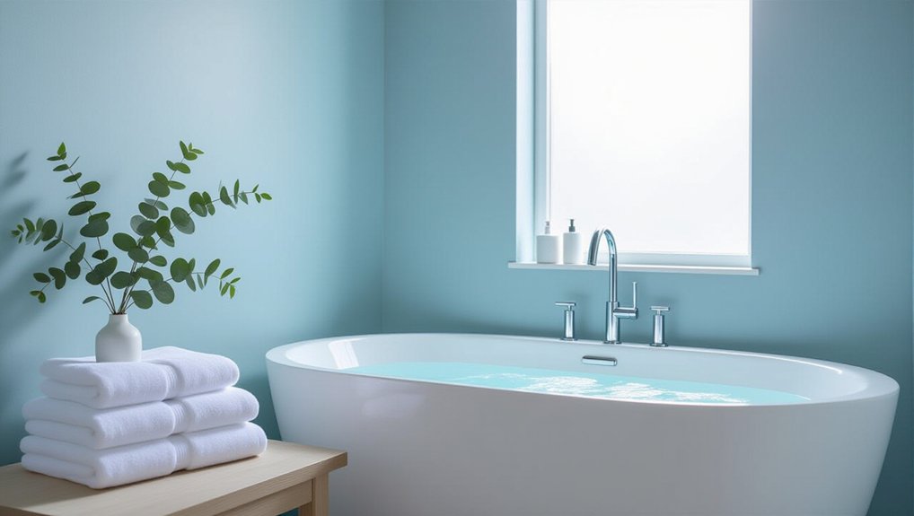
Misty blue brings a fresh, restful feel to a bathroom without making the space seem cold. This soft shade can turn your room into a tranquil oasis, especially when you choose a muted version with a hint of gray. It reflects light well, helping a small bathroom feel more open, while its cool undertone creates a calm backdrop for daily routines.
Test paint samples on different walls before committing; daylight and bathroom lighting can shift the color’s appearance. Pair misty blue walls with crisp white trim, towels, or tile to keep the palette clean and balanced.
If your bathroom lacks natural light, select a slightly lighter blue and use warm white bulbs to prevent the room from feeling stark. A satin or semi-gloss finish resists moisture and makes walls easier to clean.
Warm Neutrals for a Spa-Like Retreat
For a warmer alternative to misty blue, choose soft beige, creamy white, or muted taupe to give your bathroom a spa-like calm. These shades soften hard surfaces and pair well with natural wood, stone, and brushed-metal fixtures.
To keep the room feeling balanced, test paint samples on different walls and check them in daylight and under your bathroom lighting. Creamy whites can look yellow beside warm bulbs, while taupe may appear darker in a small room.
Choose a bathroom-rated paint with a washable finish, such as satin or semi-gloss, to support paint durability in humid conditions. Good bathroom ventilation also limits moisture buildup and helps protect painted walls.
Run the exhaust fan during showers and afterward, and repair leaks promptly. With the right shade and care, your bathroom can feel inviting without sacrificing practicality.
Muted Greens and Blues to Consider
Muted greens and blues bring a calm, natural feel to a bathroom without making it seem cold. Choose muted greens such as sage, eucalyptus, or soft olive to echo foliage and pair well with wood, stone, and white fixtures. These shades work especially well when you want colour that feels restful but still has character.
For a cooler palette, consider calming blues like dusty teal, slate, or softened blue-grey. They create a clean, tranquil backdrop and complement brushed nickel, crisp white, and pale timber.
Test your preferred shade beside your tile, vanity, and countertop before committing; the undertones should feel cohesive with those finishes. Use colour on all four walls for a wrapped, restorative effect, or limit it to a vanity wall if you prefer a quieter accent.
How Bathroom Light Changes Paint Colour
Bathroom light can shift a paint colour’s appearance, so check how a sample looks throughout the day before choosing. Natural lighting changes with the hour and weather, making cool shades appear brighter or warmer tones seem muted.
Place a large sample on different walls, then observe it in morning, midday, and evening light. Your bathroom’s orientation also matters: north-facing rooms often receive cooler light, while south-facing spaces tend to feel warmer.
Artificial illumination can alter colour just as noticeably. Warm bulbs may bring out yellow or red undertones; cool bulbs can make a shade look bluer or flatter.
Check your sample with the lights you’ll use daily, and compare finishes under those conditions. If you layer ceiling, mirror, and task lighting, assess the paint with each setting to choose a colour that stays calm and balanced.
Choosing Bathroom Paint for Humid Rooms
Once you’ve settled on a colour in your bathroom’s changing light, choose a paint that can withstand humidity. Select a bathroom-rated formula with moisture resistant finishes, which resist peeling, mildew, and frequent cleaning better than standard wall paint. Satin or semi-gloss sheens usually handle moisture well, but check the product label for suitability and follow its preparation and curing instructions.
Clean and dry the surfaces before painting; repair cracks and use a compatible primer to help the coating adhere.
Good paint can’t compensate for trapped steam. Use ventilation techniques that move damp air outdoors: run an exhaust fan during showers and for at least 20 minutes afterward, and open a window when practical. Keep the fan clean, and confirm it vents outside rather than into an attic. These steps help protect your finish and keep walls looking fresh.
Pairing Wall Colours With Tile and Fixtures
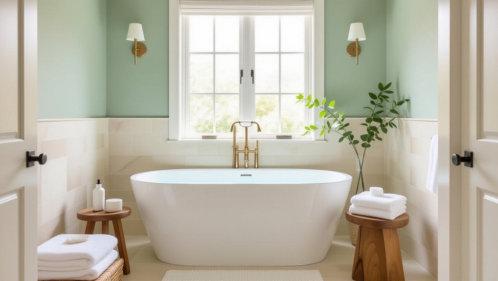
Before choosing a wall colour, identify the undertones in your tile and fixtures. Warm beige, cream, and terracotta pair naturally with soft whites, muted greens, and earthy taupes.
Cool grey or blue tile works well with crisp white, pale blue, or charcoal accents. Match the wall’s temperature to the materials for a cohesive, restful effect.
Consider contrast, too. If your tile has a strong pattern, choose a quieter paint colour so the room doesn’t feel busy. For simple tile, a deeper wall shade can add dimension without overwhelming the space.
Bathroom tile trends may favour natural stone looks or bold geometric patterns, so let your existing surfaces guide your choice.
Review fixture finish options alongside the palette. Brushed nickel suits cool tones; brass and bronze complement warmer shades. Keep finishes consistent for a polished, spa-like result.
Testing Paint Colours Before You Commit
Before you commit, paint large swatches on your bathroom walls rather than relying on tiny chips. Check them in daylight and under your bathroom lighting, since colours can shift throughout the day.
Live with the samples for a few days to see how they look alongside your tile and fixtures.
Test Large Paint Swatches
To see how a bathroom paint colour looks in your space, test large swatches on the wall rather than relying on a small chip. A patch at least 30 centimetres square gives you a clearer sense of how the colour works across a broad area. Paint directly onto the wall, or use large sample boards you can move around. Keep the surface clean and dry, and apply the same number of coats you’d use for the finished job.
Place swatches near fixtures, tiles, and cabinetry so you can judge how the colour relates to existing finishes. Consider Color psychology, too: a muted blue may feel calming, while a warm neutral can make the room feel inviting. Check the sample’s paint durability rating before choosing a bathroom formula.
Check Colours In Different Light
Once you’ve painted large swatches, check them at different times of day and under your bathroom’s artificial lighting. Morning daylight may reveal cool undertones, while warm evening light can make the same paint look creamier or more muted.
Turn on every fixture you’ll normally use, including vanity lights, and assess the colour from several points in the room. Lighting effects depend on bulb temperature, brightness, and placement, so note whether your chosen shade shifts noticeably or stays balanced.
Compare it beside tile, countertops, and cabinetry; nearby finishes can reflect colour onto the wall. A soft green that feels calming in daylight might look dull under a cool bulb.
Choose lighting that supports the shade’s Mood enhancement and the restful atmosphere you want, rather than relying on a single viewing condition.
Live With Samples First
After checking how light affects each shade, live with your paint samples for a few days before choosing. Paint large swatches on different bathroom walls, or apply samples to poster board you can move around.
Use the same primer and finish you plan for the final coat; paint application techniques and surface preparation can change how a colour looks. Keep samples near tile, counters, and towels, then view them during your usual routines.
Notice whether each shade feels calming in the morning and comfortable under evening lighting. Color psychology can guide your response, but your own preferences matter most.
If a colour feels too cool, stark, or intense after repeated viewing, cross it off. Choose the shade that consistently supports the restful atmosphere you want, not just the one that first caught your eye.
Conclusion
Choose a bathroom paint colour that feels calming in your light and works with your tile and fixtures. Soft sage, misty blue, and warm neutrals can turn everyday routines into a more restful ritual, like stepping into a quiet retreat. Before you commit, test samples at different times of day, then use a moisture-resistant satin or semi-gloss finish. With thoughtful colour and a durable finish, you’ll create a spa-like bathroom that stays inviting and practical.