


Choosing paint for a home that still feels right years from now takes more than following the latest trend. You’ll get a more lasting result when you match colour to your room’s light, fixed finishes, and the mood you want to create. Warm whites, balanced greiges, earthy shades, and muted blues and greens offer enduring options, while deeper tones can add definition. The key is knowing which colours suit your space—and how to test them before you commit.
Match Paint Colours to Your Room’s Light
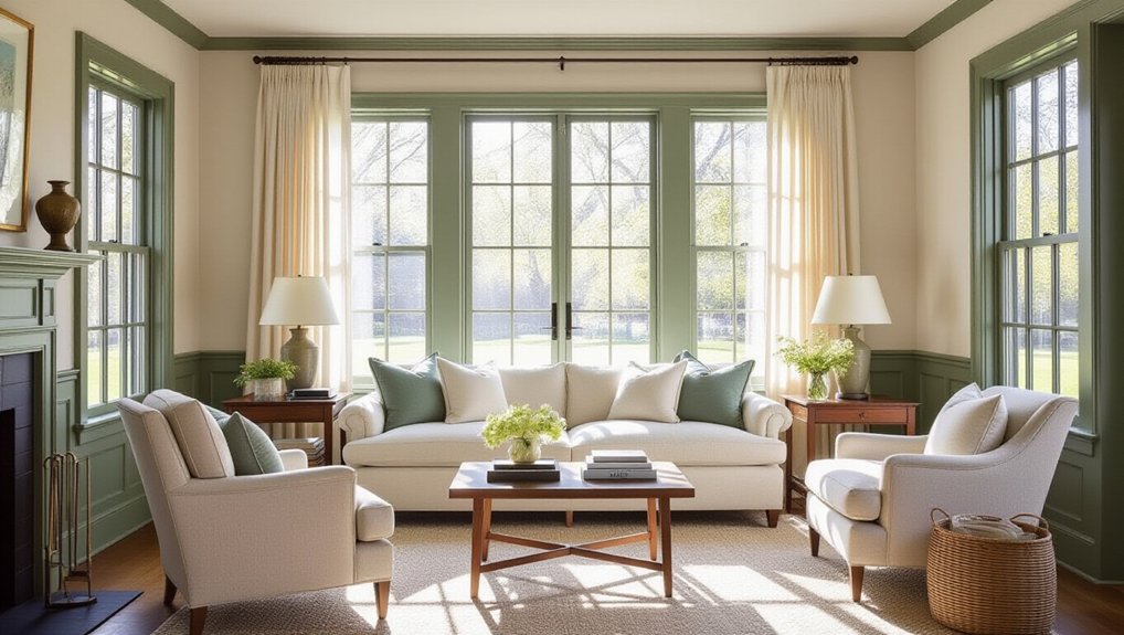
Before choosing a paint colour, notice how light moves through your room: north-facing spaces tend to make colours look cooler, while south-facing rooms bring out warmth.
East-facing rooms shift from bright morning light to cooler afternoons; west-facing rooms do the opposite, glowing warmly near sunset.
These lighting effects can change a colour’s appearance throughout the day, so don’t rely on a small paint chip. Test large samples on several walls, then observe them morning, afternoon, and evening with your usual lamps switched on.
Check how nearby flooring, furniture, and window coverings influence the result, too.
Color psychology matters, but judge a shade in your actual space before choosing. If a colour feels too stark or dull under your room’s light, adjust its undertone or depth.
Your room’s changing light should guide the decision.
Choose Timeless Warm White Paint Colours
Warm white paint creates a soft, welcoming backdrop that feels more enduring than stark white. Choose a shade with subtle cream or yellow undertones to soften rooms with cool light. In sunny spaces, a cleaner warm white can keep walls from looking too yellow. Test large samples on several walls and check them throughout the day before you commit.
For a cohesive look, carry the same white across connected rooms, then vary the finish: use matte on walls and satin on trim for gentle definition.
Thoughtful furniture pairing tips include balancing warm walls with natural wood, textured linen, or dark accents. If you want a focal point, explore accent wall ideas using a deeper, complementary colour rather than a second white. This keeps your palette calm while adding depth and character.
Try Timeless Greige Paint Colours
Greige blends the warmth of beige with the restraint of gray, making it a versatile choice for rooms that need balance. Choose a shade by testing large samples on several walls; daylight, lamps, and nearby finishes can shift its undertone from rosy to green or violet.
If your room faces north, a warmer greige can soften cool light. In sunnier spaces, a cooler option may keep the room from feeling too warm.
Look to Historical color palettes for shades that have endured across changing styles, then consider how Cultural influences shape your preferences. Greige can complement both traditional millwork and clean-lined furniture, so you won’t need to redesign around it.
Pair it with crisp trim for definition, or use a closely matched trim color for a quieter, more continuous effect.
Explore Timeless Earthy Paint Colours
Earthy paint colours bring lasting depth to a home without tying it to a passing trend. Think clay, ochre, warm brown, and muted terracotta: shades that feel grounded yet adapt to changing furnishings. Their appeal often comes from Natural pigment, which gives these colours subtle variation and visual warmth.
Cultural influences also shape earthy palettes, from sunbaked Mediterranean walls to rich, mineral tones found in traditional crafts.
To choose well, consider your room’s light and existing finishes. North-facing spaces may need a lighter, warmer clay, while a bright room can handle deeper ochre.
Test large samples on several walls; undertones shift throughout the day. Pair earthy paint with timber, stone, linen, or simple ceramics to build texture without clutter.
If you’re unsure, use a saturated shade on one wall or in a small room, then extend it once you’ve lived with it.
Bring Calm With Timeless Blue and Green Paint
Blue and green paint bring a quiet sense of calm while remaining versatile enough for a timeless home. Choose muted, nature-inspired shades to create rooms that feel restful without looking dated.
Soft blue can make a bedroom or study feel open and composed, while sage green brings a grounded warmth to kitchens and living spaces. Consider how daylight shifts across each room before you commit; test large samples on different walls and view them morning and evening.
Mood enhancement matters: cooler blues can encourage focus, while gentle greens often feel restorative. These colours also carry cultural significance, shaped by associations with water, sky, growth, and renewal.
Balance them with natural wood, warm whites, or textured neutrals, and repeat your chosen shade in small accents to connect rooms without making your palette feel overly matched.
Add Depth With Timeless Charcoal and Navy
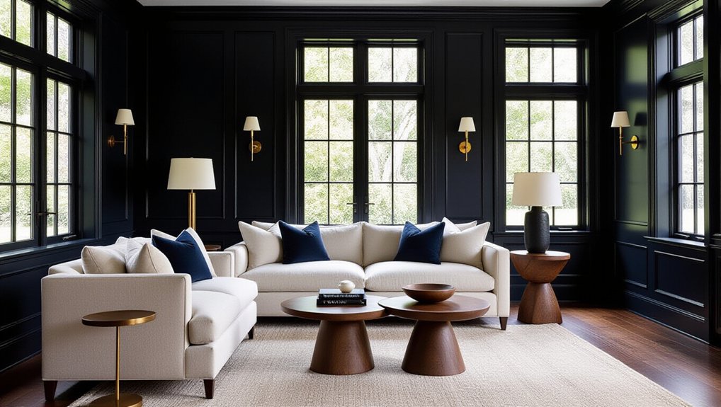
When you want a room to feel more grounded, charcoal and navy add depth without sacrificing timeless appeal. Use charcoal to anchor a living room, dining area, or built-in cabinetry; choose navy when you want a softer, more classic presence.
Both colours work best when you consider the room’s natural light and balance their weight with lighter elements. Pair deep walls with warm wood, pale upholstery, or crisp trim to keep the space from feeling closed in. Add contrast accents through brass hardware, cream textiles, or artwork with brighter tones.
Textured finishes, such as linen, wool, and matte paint, bring dimension to these saturated shades and prevent a flat look. If you’re painting a smaller room, use the darker colour selectively on one wall, cabinetry, or trim for a deliberate, polished effect.
Test Paint Colours Before You Commit
Before committing, sample each colour directly on the walls you plan to paint.
Check the swatches in the morning, afternoon, and evening, since changing light can shift how a shade looks.
This simple test helps you choose a colour that feels right throughout the day.
Sample Colours In Place
Paint samples can look different on your walls than they do on a colour card, so test your shortlisted shades in the room before committing. Paint large swatches directly on the wall, or use movable boards primed with the same finish as your intended surface. Small chips won’t reveal how a colour reads across a broad area, and paint texture can affect its depth and sheen.
Place samples beside flooring, trim, countertops, and fabrics to judge how the undertones interact with your existing finishes. Keep the number of options manageable; comparing two or three shades makes differences easier to spot.
Consider Color psychology, too: a soft green may feel restful, while a crisp white can feel energising. Live with each sample before choosing, and assess how it suits the room’s purpose.
Observe Changes Throughout The Day
As daylight shifts, the same paint colour can look warmer, cooler, brighter, or more muted. Watch your sample from morning through evening, checking it in every room where you plan to use it. Natural light variations change with window direction, weather, and season, so don’t judge a shade by one glance.
Notice how it responds beside your flooring, furniture, and trim, too; these surroundings can alter its appearance.
Turn on your usual lamps after sunset and compare the colour under their bulbs. A shade that feels calm by day may seem stark or muddy at night.
Consider how each shift affects the room’s purpose: Mood enhancement techniques might include choosing a soft, warm tone for a restful bedroom or a clearer hue for an energetic workspace.
Live with the sample before committing.
Conclusion
Timeless paint isn’t about following a trend; it’s about choosing colours that feel right in your home. Let your room’s light guide you, then compare warm whites, greige, earthy shades, muted blues and greens, or deeper accents against your furnishings. Sample generously and live with each colour through changing light before you commit. Like a well-loved natural material, the right shade gains character over time. Trust what works in your space, and you’ll create a home that feels welcoming season after season.