
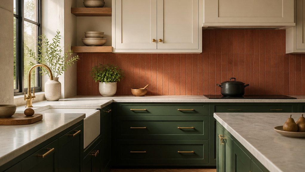

A modern kitchen palette doesn’t need a full renovation; changing the relationship between your cabinet colour, worktops and lighting can make the whole room feel current. You can use crisp black and white for contrast, or bring in green, blue and warm neutrals for a softer look. The key is choosing colours that suit your finishes and natural light—and a few practical details can make that choice easier.
Black and White Kitchen Colour Schemes
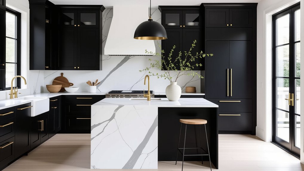
Black and white kitchen colour schemes create a crisp, high-contrast look that suits both modern and traditional homes. Use white cabinetry to keep your kitchen feeling bright, then introduce black through handles, taps, lighting or a statement island. This balanced monochrome contrast feels current without relying on short-lived trends.
Choose finishes carefully: matte black adds a soft, contemporary edge, while glossy surfaces reflect light and sharpen the scheme. If you want more drama, explore accent wall ideas such as black tile behind open shelving or a painted feature wall away from busy work zones. Keep surrounding surfaces simple so the focal point doesn’t overwhelm the room.
For a warmer effect, add brass hardware or textured white tiles. Repeat each finish at least twice to make your palette feel intentional and cohesive.
Green Kitchen Schemes With Natural Wood
Green kitchen schemes pair beautifully with natural wood, bringing colour and warmth into the same space. Choose sage or olive cabinetry for a current look that feels grounded rather than stark.
Pair deeper green doors with pale oak shelves or a timber island to create contrast and keep the room visually balanced.
Let the wood’s grain add texture, then repeat it in a few considered details, such as stools, handles, or open shelving. Natural finishes help your kitchen feel connected to the outdoors without making the palette busy.
For a more sustainable update, consider Eco friendly materials, including reclaimed timber or responsibly sourced wood.
Protect worktops with a suitable finish, especially near sinks and cooking areas. Keep surrounding surfaces simple so the green and wood remain the focus, and use layered lighting to bring out their tones throughout the day.
Warm Neutral Kitchen Colour Schemes
Warm neutral kitchens pair cream or greige cabinets with finishes that keep the palette fresh and inviting.
Add warm wood accents to bring depth and balance to these soft tones.
You’ll get a versatile scheme that feels current without chasing short-lived trends.
Cream and Greige Cabinets
How do you create a kitchen that feels both current and welcoming? Start with cream or greige cabinets: these warm neutrals soften a room without making it feel dated. Cream brings brightness, while greige adds a subtle, contemporary depth. Choose the shade according to your light; north-facing kitchens often benefit from cream’s warmth, while sunlit spaces can handle cooler greige.
Use Color contrast to keep cabinetry from blending into every surface. Pair pale cabinets with a deeper island, dark hardware, or a crisp countertop, then check samples in morning and evening light.
Texture layering adds interest without introducing visual clutter: consider matte cabinet fronts, softly veined stone, and tactile tile. Keep undertones consistent across finishes, and limit competing patterns. You’ll get a balanced, adaptable palette that feels polished now and easy to refresh later.
Warm Wood Accents
To add warmth without overwhelming a neutral kitchen, bring in wood through a few purposeful details. Choose oak shelves, walnut stools, or a timber island trim to soften cream and greige cabinetry while keeping the palette contemporary.
Match undertones: honeyed woods complement warm whites, while smoked oak adds depth beside cooler greige. Repeat the same wood tone in two or three places so the room feels considered, not cluttered.
For a lighter touch, use cutting boards, a framed print, or woven accessories; these add rustic charm without making the kitchen feel dated.
Keep finishes matte or lightly oiled to highlight natural grain and resist a glossy, overly formal look.
Pair wood with stone, brushed metal, and layered lighting for a cozy ambiance that still feels fresh and easy to maintain.
Timeless Blue and White Kitchen Schemes
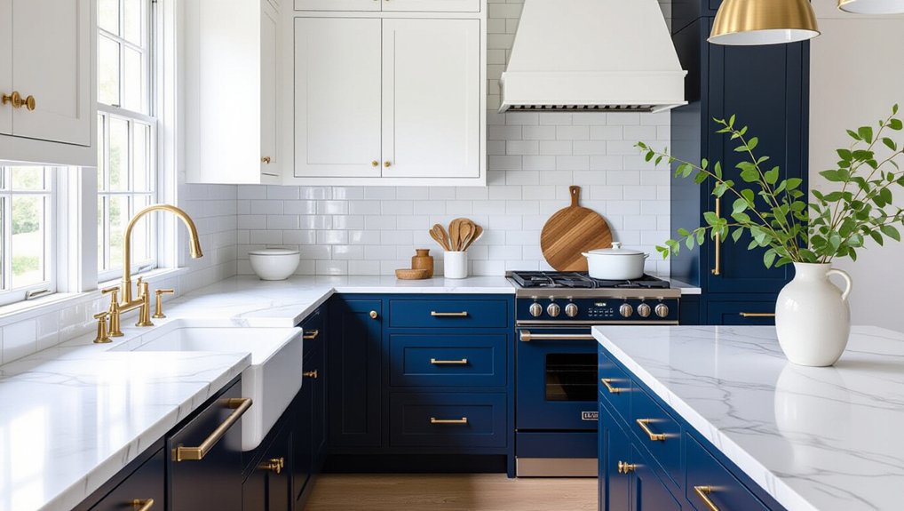
Blue and white kitchens remain a classic because the contrast feels crisp without looking stark. Choose a deep navy or muted denim blue to give your space depth, then use white to keep the overall effect bright.
If you prefer a softer look, try powder blue with warm white; it feels fresh without chasing a fleeting trend.
You can introduce blue through painted cabinetry, a feature wall, or smaller details such as stools and textiles. Keep the balance intentional: too much navy can feel heavy, while scattered blue accents may lack impact.
Add Vintage accents, such as aged brass handles or a patterned runner, to bring character. Statement lighting can sharpen the scheme and create a focal point.
Finally, repeat each shade in a few places so your palette feels considered and cohesive.
Match Kitchen Colours to Cabinets and Worktops
Pair your cabinets with worktops that complement their colour and material, whether you prefer subtle contrast or a tonal look.
Balance light and dark shades to keep the kitchen feeling bright and grounded.
Coordinate finishes, too, so your palette feels cohesive and current.
Pair Cabinets With Worktops
Cabinet and worktop colours set the tone for your kitchen, so choose them as a pair rather than in isolation. Start with the material you’re least willing to compromise on, then select a finish that complements its undertones.
Warm oak cabinets work naturally with creamy quartz, while deep green cabinetry pairs well with veined stone or a softly textured surface. For a streamlined look, repeat a colour or undertone across both elements; for more character, introduce contrast through pattern or finish.
Order samples and view them together in your kitchen’s actual lighting before committing. Then coordinate cabinet hardware and backsplash tiles with the palette, keeping their finishes consistent rather than competing for attention.
This considered approach gives your kitchen a cohesive, current feel without relying on short-lived colour trends.
Balance Light And Dark
Balance light and dark tones to give your kitchen depth without making it feel stark or heavy. If your cabinets are deep navy or forest green, pair them with a pale worktop to lift the scheme and keep the room feeling open.
For white or light-oak cabinets, a charcoal or veined stone surface adds definition and a more contemporary edge.
Consider how natural light shifts throughout the day. In a north-facing kitchen, too many dark surfaces can feel flat, so use lighter worktops or cabinetry to brighten the space.
In a sunlit room, richer tones can create welcome depth without overwhelming the layout. Check samples in your kitchen, since lighting contrast changes how colours appear.
Aim for colour harmony by repeating light and dark in measured proportions, not matching every surface. You’ll get a balanced, modern result.
Coordinate Colours And Finishes
When you choose cabinet and worktop colours, coordinate their undertones and finishes for a cohesive look. Pair warm oak cabinets with cream, beige or softly veined worktops; cool grey cabinetry works well with crisp white or charcoal surfaces. You don’t need an exact match: repeat one colour in smaller details to create a deliberate connection.
Balance texture as carefully as colour. Matte cabinets feel contemporary beside polished stone, while subtle wood grain can soften sleek quartz. Limit strong patterns to one main surface, then choose backsplash options that echo a quiet tone or introduce restrained contrast.
Test samples together in your kitchen’s natural and artificial light before committing, since shades shift throughout the day. Finally, coordinate handles and lighting fixtures with your chosen finishes; brushed metal adds warmth, while black accents sharpen a modern scheme.
Choose a Kitchen Palette for Your Space
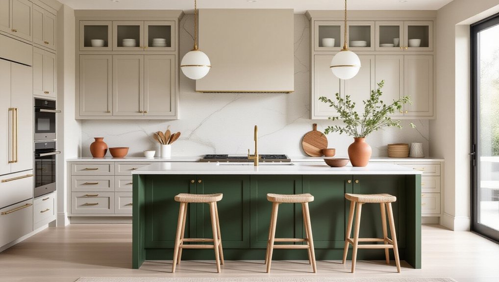
Choosing a kitchen palette starts with the space you have, not just the colours you love. Assess natural light, room size, and fixed features such as flooring and countertops before choosing paint or cabinetry.
In a compact kitchen, light neutrals can open up the room, while deeper shades add definition in a larger space. Consider Color psychology, too: soft greens feel calming, and warm terracotta brings energy without overwhelming the room.
Build your scheme around two or three complementary tones, then repeat them across cabinets, walls, and accessories for a cohesive finish. Accent walls can introduce a bolder hue, especially in an open-plan kitchen, but keep surrounding surfaces restrained.
Test samples at different times of day; changing light can shift a colour’s appearance. Choose a palette that suits your home and daily routine, not a passing trend.
Conclusion
Your kitchen’s colour scheme can transform the whole room without a full renovation. In fact, research suggests colour can influence mood and perception, making your palette more than a finishing touch. Choose crisp black and white for instant contrast, calming green with natural wood for warmth, or blue and white for enduring freshness. Then match your colours to your cabinets, worktops and light. Start with one confident change, and you’ll give your kitchen a modern feel that suits your space.