


The best living room paint colours make your space feel welcoming without limiting your furniture or décor choices. Start with warm neutrals, creamy whites, or earthy greens, then consider how natural light and finishes will affect each shade. A colour that looks soft and balanced on a paint chip can shift dramatically on your walls—so a few practical checks can help you choose with confidence.
How to Choose a Welcoming Living Room Color
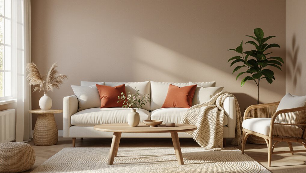
To choose a welcoming living room color, start with how you want the space to feel and how you use it. Color psychology can help you connect a shade with a mood: muted hues often feel restful, while clearer, brighter colors can add energy. Consider whether you host guests, read, or relax there, then choose a color that supports those activities.
Next, test samples in the room. View them on different walls and at several times of day, since natural and artificial light can change how a color looks. Check how each option works with your flooring, furniture, and artwork.
Cultural influences also shape how people interpret colors, so trust your own associations and preferences rather than relying on universal rules. Choose the shade that feels comfortable and suits your home.
Warm Neutrals for Living Rooms
Warm neutrals create a welcoming living room without the starkness of pure white or the weight of darker shades. Consider taupe, greige, warm beige, and muted mushroom for walls that feel grounded yet flexible. These shades pair well with wood, leather, stone, and varied textiles, so you can update furnishings without repainting.
Color psychology helps explain their appeal: earthy undertones can make a room feel settled and comfortable. Check samples on several walls, since daylight and lamps can shift a neutral’s appearance. If your room faces north, choose a warmer undertone; in strong southern light, a balanced shade can prevent an overly yellow look.
Compare paint finish options before buying. Eggshell suits most living rooms, while satin offers greater washability in busy spaces. Test your selection beside flooring and trim.
Cozy Creamy Whites for Living Rooms
Choose creamy white with soft, warm undertones to give your living room a welcoming feel without looking stark.
Pair it with natural wood, warm metals, or layered neutral fabrics for a balanced palette.
Check paint samples in your room’s changing light before you commit.
Soft, Warm Undertones
Soft, warm undertones give living room walls a cozy glow without the starkness of pure white. Look for creamy whites with subtle yellow, peach, or red notes; each can soften daylight and make a room feel more inviting. Test paint samples on several walls, then view them in morning, afternoon, and evening light.
Nearby windows, lamps, and existing surfaces can shift how a shade appears, so judge the color in your actual space.
Color psychology offers a practical guide: warm whites tend to feel welcoming and relaxed, while overly yellow shades may look dated under warm bulbs.
Choose paint finish options to suit both use and light. An eggshell finish hides minor wall flaws and cleans more easily than flat paint. For busy living rooms, prioritize durability without sacrificing the gentle, comfortable effect you want.
Creamy White Pairings
When you pair creamy white walls with natural materials, the room feels layered rather than stark. Choose a white with subtle yellow or red undertones to soften daylight and complement oak floors, linen upholstery, or woven rugs. Test paint samples on several walls; the color can look cooler in shade and warmer near a window.
Creamy white pairings work especially well with muted greens, warm taupes, and terracotta accents. These neutral color combinations give you flexibility to change cushions, artwork, and accessories without repainting. For contrast, add dark wood or black metal in small doses, keeping the overall palette calm.
If your furnishings already have strong patterns, use a cleaner cream and limit additional colors. Check samples beside your flooring and trim, since bright white details can make cream walls appear more yellow than expected.
Calm, Earthy Greens for Living Rooms
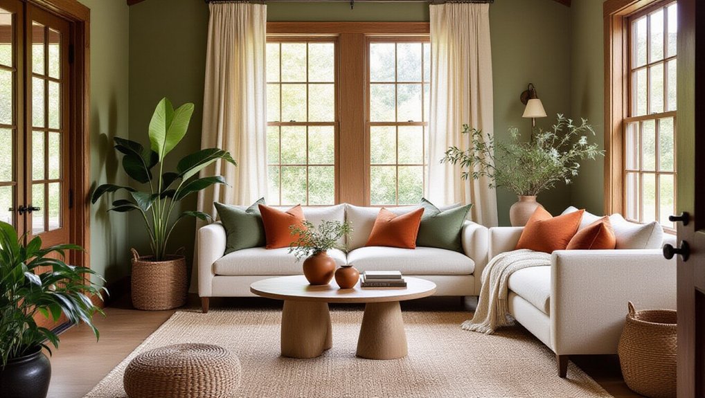
Soft sage walls bring a calm, natural feel to your living room without overwhelming the space.
Pair them with olive green accents for depth and contrast.
Test paint samples in your room’s light before you commit.
Soft Sage Walls
Muted sage brings a calm, earthy feel to a living room without making the walls seem stark or heavy. This soft green suits rooms where you want a restful backdrop that still feels warm and connected to nature.
Choose a shade with enough depth to hold its colour in changing light; pale versions can look washed out in north-facing spaces. Test large samples on several walls, then check them morning and evening before committing.
Pair sage walls with warm white trim, natural wood, and textured fabrics to keep the room inviting without crowding the palette.
Consider interior paint finishes carefully: matte hides minor wall flaws, while eggshell offers easier cleaning.
Use sound paint application techniques, including thorough surface preparation and even, overlapping strokes, for a smooth, consistent result.
Olive Green Accents
Olive green accents add depth and an earthy calm to a living room without committing you to green walls. Use this grounded shade on a feature wall, built-in shelves, or painted cabinetry to create a focal point while keeping the rest of the room light.
Pair olive with warm whites, soft beige, or natural wood; these combinations prevent the green from feeling heavy and make your space welcoming.
For a measured look, repeat olive in cushions, a lampshade, or artwork rather than spreading it across every surface. Check paint samples in morning and evening light, since olive can shift from golden to muted.
If you want nature-inspired decor, combine the colour with linen, woven textures, and leafy plants. These thoughtful olive green accents bring lasting warmth without overwhelming your living room.
Warm Greige Paint for Different Styles
Warm greige adapts easily to different living room styles, from traditional spaces with rich wood furniture to modern rooms with clean lines and simple finishes.
In a classic room, choose a deeper, taupe-leaning shade to complement carved details and layered fabrics. For a contemporary space, select a lighter greige with subtle gray undertones; it keeps the palette crisp without feeling stark.
Use Color psychology to guide your choice: warm undertones can make a large room feel more inviting, while a balanced greige helps smaller spaces feel calm and open.
Test samples on several walls, since daylight and artificial lighting can shift the color noticeably.
Then coordinate interior accents, such as cushions, rugs, and metal finishes, with the paint’s undertone. You’ll create a cohesive backdrop that suits your furniture and personal style.
Terracotta and Clay Living Room Colors
For a richer alternative to greige, terracotta and clay bring earthy warmth to a living room. These shades suit rooms with natural light, where their red and brown undertones look grounded rather than heavy.
Test paint samples on more than one wall, since daylight and evening lamps can shift the color noticeably. If you’re unsure about a full-room application, use clay on a feature wall and keep adjoining surfaces in a warm off-white.
Balance the depth with pale wood, linen, or a simple cream rug; these materials soften the palette without making it feel bland. Add terracotta accents through cushions, pottery, or a lampshade, and layer in clay-inspired decor for a cohesive look.
Choose muted, dusty tones for a relaxed finish, or a deeper rust for stronger definition. Don’t overlook trim: a creamy shade keeps edges crisp and welcoming.
Soft Blues That Feel Warm
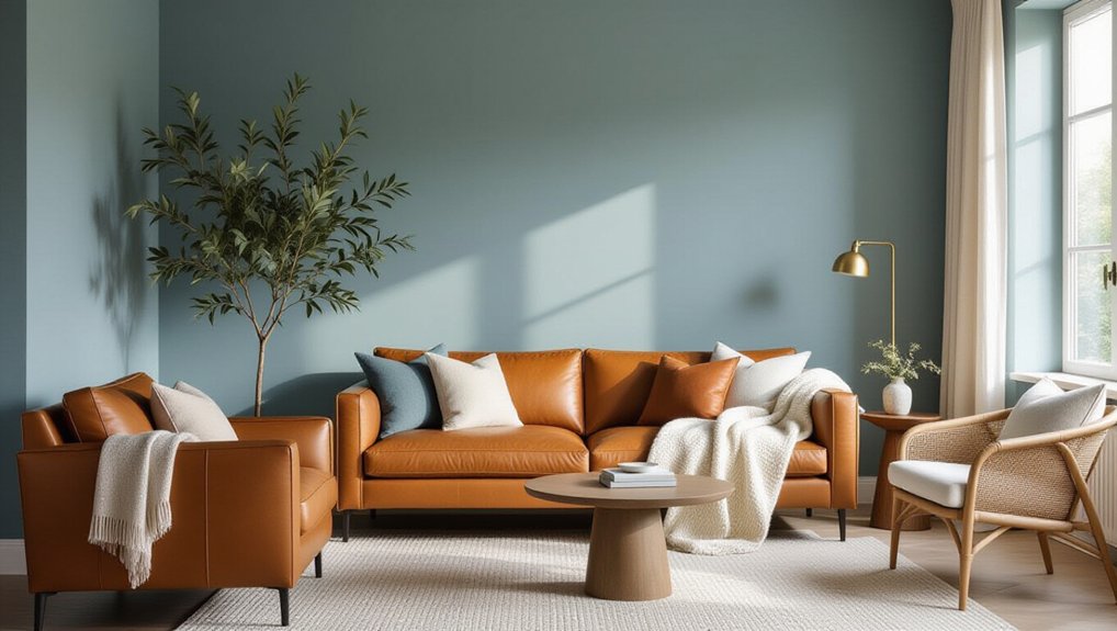
Although blue can feel cool, soft shades with gray or green undertones bring a calm, welcoming quality to a living room. Choose muted hues such as dusty blue, slate, or blue-green to create a soothing backdrop without making the space feel stark.
If your room has warm wood floors or leather furniture, these shades provide gentle contrast while keeping the palette balanced. Pair blue walls with cream textiles, natural wood, and brushed brass for added warmth.
Cozy corner accents, such as a rust-colored cushion or a woven throw, can keep the room inviting and personal. Use mood-enhancing lighting through layered lamps and warm-toned bulbs to support a relaxed atmosphere.
Test paint samples beside your furnishings, and choose the shade that feels comfortable with your existing finishes.
How Light Changes Living Room Paint Colors
Because natural and artificial light shift throughout the day, the same paint color can look noticeably different from morning to evening. In a north-facing living room, cool, indirect light can make blues and greiges feel sharper, so warmer undertones often create a more welcoming effect.
South-facing rooms receive stronger sunlight, which can brighten colors and emphasize yellow or red notes. East-facing spaces look warm in the morning but cooler later; west-facing rooms gain golden warmth toward evening.
Your natural lighting also changes with window size, nearby buildings, trees, and seasonal shifts. At night, bulbs affect how walls read: warm LEDs soften colors, while cooler bulbs can make them appear crisper.
Paint sheen matters, too. Glossy finishes reflect more light and highlight surface flaws; matte finishes absorb light for a quieter, softer appearance.
How to Match and Test Living Room Paint Colors
Before choosing a living room paint color, compare it with the finishes and furnishings that will stay in the room. Hold paint chips beside flooring, upholstery, wood, and metal to spot undertones that clash or harmonize.
Consider Color psychology, too: muted greens can feel restful, while warm terracotta may make a space feel more inviting.
Don’t rely on a small chip alone. Paint large sample boards, then move them around the room and observe them in morning, afternoon, and evening light. Check each shade against your existing decor before committing.
Finally, make a thoughtful paint finish selection. Matte finishes hide minor wall flaws, while eggshell offers a soft sheen and easier cleaning. Use satin where walls need greater durability, but avoid excessive shine if it highlights imperfections.
Conclusion
Choose a living room color that supports the mood you want, then consider your furnishings, finishes, and natural light. Warm neutrals, creamy whites, earthy greens, terracotta, and soft blues can all feel welcoming when their undertones suit your space. Test sample patches at different times of day before committing; paint can shift like a chameleon as the light changes. Finish the room with natural textures and warm accents, and you’ll create a comfortable backdrop that feels inviting year-round.