
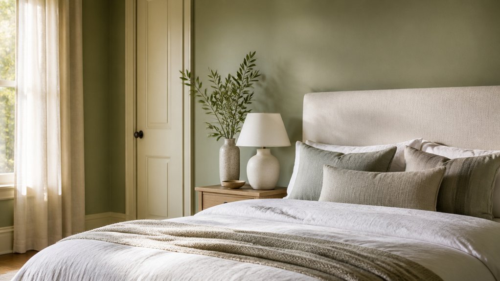

Choosing a bedroom paint colour isn’t just about picking a shade you like; light, room size, and existing finishes all affect how it looks on your walls. Soft neutrals, muted greens, and gentle blues can help create a restful backdrop, while deeper hues bring a cosier feel. The right choice also depends on the room’s orientation and the finish you use—details that can make a promising colour feel quite different in practice.
How Does Light Change Bedroom Paint Colours?
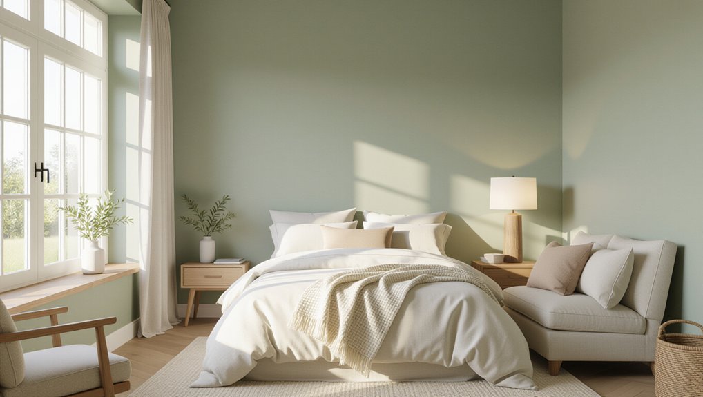
Light can make the same bedroom paint colour look noticeably different throughout the day. Morning natural lighting often feels cool and crisp, while afternoon sun can add warmth and intensify colour.
North-facing rooms usually receive cooler, steadier light; south-facing rooms tend to look brighter and warmer. Check your room’s exposure before choosing a shade, and observe samples on more than one wall.
Artificial lighting changes the result after sunset. Warm bulbs can make some colours appear yellower or richer, while cool bulbs may sharpen their appearance.
Your lampshades and fixtures also affect how light spreads across the walls. Paint large sample patches, then view them at different times with your usual lights switched on.
This simple test helps you judge the colour in your actual bedroom, not just under store lighting or on a screen.
Soft Neutral Bedroom Paint Colours
Soft neutral bedroom paint colours create a calm backdrop without making the room feel stark. Choose warm white, cream, pale taupe, or soft greige to bring gentle depth to your retreat. Test sample patches on different walls, since daylight and lamps can shift undertones. Compare each shade with your bedding, flooring, and trim before committing.
Use wall texture to guide your finish: matte paint can soften minor imperfections, while eggshell adds a subtle sheen and cleans more easily. For busy bedrooms or walls that need frequent wiping, check paint durability and select a washable formula.
Prepare surfaces carefully; even the best neutral won’t look polished over dust, cracks, or uneven patches. Keep trim slightly lighter or darker for definition, and limit competing colours so your room feels cohesive, restful, and easy to update over time.
Muted Greens That Bring Nature Indoors
Choose soft sage for a calm, nature-inspired backdrop that keeps your bedroom feeling light.
Use olive green on an accent wall or in smaller areas when you want more depth.
Pair either shade with warm whites, beige, or natural wood to balance the palette.
Soft Sage Serenity
Muted sage green brings a quiet, natural feel to a bedroom without overwhelming the space. This soft, low-saturation shade suits nature-inspired palettes and works especially well when you want a restful backdrop. Its calming color psychology can help your room feel grounded, though light and finish also shape the result.
Test paint samples on several walls and check them in morning and evening light; sage can shift from fresh to gray depending on exposure. Choose a matte or eggshell finish to soften the walls, and pair the color with warm white bedding, pale wood, or natural linen for gentle contrast.
If your room receives little daylight, select a lighter sage to keep it from feeling enclosed. Use the shade across walls or on one feature wall, keeping the palette simple for a cohesive retreat.
Olive Green Accents
Olive green accents bring a grounded, natural note to a bedroom without making the palette feel heavy. Use this muted shade on a headboard, bedside table, or a single feature wall to add depth without overwhelming the room. If you’re unsure about commitment, start with painted furniture or a smaller area; you can assess the effect in daylight and lamplight before expanding it.
Olive green works especially well in calming bedroom palettes because its earthy undertone feels restful rather than stark. Choose a soft, matte finish to limit glare and keep the colour’s character gentle.
In a smaller bedroom, apply it selectively so the room retains an open feel. In a larger space, a broader painted surface can create a cocooning effect. Test a sample beside your existing furnishings, and check it at different times of day before choosing your final placement.
Pairing Green With Neutrals
When you pair muted green with warm neutrals, you bring a natural feel into the bedroom without making the palette feel busy. Choose sage, eucalyptus, or soft moss for the walls, then balance the colour with cream bedding, warm white trim, or pale wood furniture.
These Neutral palettes keep the room light while adding enough contrast to make green feel intentional. If you’d rather keep your walls neutral, introduce Green accents through a painted bedside table, cushions, or a simple upholstered headboard.
Repeat the green in one or two places so the scheme feels cohesive, not scattered. Check paint samples in morning and evening light; muted greens can shift noticeably beside beige or grey.
For a restful finish, choose soft textures and limit sharper contrasts.
Soothing Blues for a Restful Bedroom
Soft blue shades can make your bedroom feel calm and restful. Choose a muted blue for the walls to keep the space soothing rather than cool.
Layer blue accents in bedding and curtains to add depth without overwhelming the room.
Soft Blue Shades
For a restful bedroom, choose a soft blue with muted undertones, such as powder blue, pale slate, or blue-gray. These shades create a quiet backdrop without making your room feel cold.
Color psychology links blue with calm, but the shade’s depth and your room’s natural light also shape its effect. Test sample patches on different walls, then check them in morning and evening light before you commit.
If your bedroom faces north, choose a slightly warmer blue to balance cooler daylight. In a bright, south-facing room, a grayer blue can keep the colour from feeling too vivid.
Use sound paint application techniques: clean and prime the walls, apply two even coats, and let each coat dry fully. A matte finish softens imperfections and suits a low-glare, restful space.
Layered Blue Accents
Layered blue accents can extend a soft blue palette without painting every wall. Choose one deeper shade, such as slate or muted navy, for a headboard wall, alcove, or narrow panel. Keep surrounding walls pale to preserve an airy feel and make the contrast restful rather than dramatic. Test samples in morning and evening light; blue can shift noticeably as daylight fades.
You can also build depth through bedroom paint textures. A matte finish softens light, while a subtle brushed effect adds interest without competing with bedding or artwork. Repeat your accent blue in cushions, a throw, or a lampshade to connect the room’s palette.
Layered blue accents work best when you limit strong tones and balance them with warm wood, cream, or natural linen. This keeps your retreat calm and cohesive.
Warm Earthy Bedroom Paint Colours
Warm earthy paint colours—such as clay, terracotta, muted ochre and warm taupe—bring a grounded feel to the bedroom without making it look dark. Choose a shade that suits your room’s natural light: deeper terracotta can feel rich in a bright space, while pale taupe helps a dim room feel open.
Use one colour across the walls for a cohesive backdrop, then add texture through linen, wood and woven accents. If you want more definition, paint a headboard wall in a deeper tone; Bold accent walls work best when the remaining walls stay quiet.
Consider contrasting trim in cream or soft white to sharpen the room’s edges without introducing a stark effect. Test samples beside your flooring and bedding, and check them in morning and evening light before committing to a full coat.
Gentle Pinks and Lavender Shades
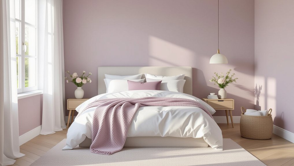
Gentle pinks and lavender shades offer a softer alternative to earthy tones, adding colour without overwhelming the bedroom. These hues can make your room feel calm and welcoming, while bedroom colour psychology suggests that muted tones encourage relaxation more effectively than highly saturated shades.
Choose a dusty rose or pale lilac if you want colour that remains easy to live with. Check samples on several walls, since daylight and warm bulbs can shift their appearance.
Pair these shades with crisp white, soft grey, or natural wood for a balanced scheme.
For reliable results, use sound paint application techniques: prepare the surface, apply a suitable primer, and test your chosen finish before painting the whole room.
An eggshell finish offers subtle sheen and is easy to clean. You’ll get an even, restful result.
Deep Colours for a Cosy Bedroom
Deep colours can make a bedroom feel cosy and intimate when you balance them with the room’s light and furnishings. Navy, forest green, charcoal and aubergine create depth, helping a large or bright room feel more enclosed.
In a smaller bedroom, use a deep shade on one wall or across the lower half to add character without overwhelming the space.
Consider bedroom colour psychology: blue and green often feel restful, while burgundy and plum bring warmth and richness. Your furnishings can reinforce that mood.
Pair dark walls with pale bedding, warm wood and soft lighting to keep the room inviting; choose metallic accents for subtle contrast.
Current paint colour trends favour earthy, saturated tones, but their appeal depends on thoughtful balance. Repeat the wall colour in small details for a cohesive finish.
How to Choose a Bedroom Paint Colour
To choose a bedroom paint colour, consider the room’s natural light, size and existing furnishings before settling on a shade. North-facing rooms often benefit from warm undertones, while bright spaces can handle cooler hues.
In a small bedroom, pale colours can make walls feel more open; deeper shades add intimacy when balanced with lighter bedding or trim.
Use Color psychology to guide your choice: muted blues and greens can feel restful, while warm neutrals create a welcoming atmosphere.
Don’t rely on a tiny swatch. Paint large sample patches on different walls, then observe them in morning, afternoon and evening light.
Check each colour against your flooring, curtains and furniture before committing.
Careful paint application techniques help you assess the true shade and avoid surprises once you’ve covered the room.
Which Paint Finish Works Best in a Bedroom?
Which paint finish works best in a bedroom depends on how much wear the walls get and the look you want. Flat or matte paint hides small surface flaws and creates a soft, low-glare appearance, making it a strong choice for adult bedrooms with little traffic. However, it marks easily and can be difficult to clean.
Among paint finish options, eggshell offers a practical balance: its subtle sheen resists light scuffs and wipes clean more readily than matte.
Choose satin for children’s bedrooms, busy hallways, or walls that need frequent cleaning; its higher sheen highlights imperfections, so prepare surfaces carefully.
Consider maintenance considerations alongside appearance. Use the same finish across walls for a consistent look, and reserve semi-gloss for trim, doors, and window frames.
Test samples in your room’s lighting before committing.
Conclusion
Choose a bedroom colour that feels restful in your morning light and comforting after dark. Pair warm whites with wood, muted greens with natural textures, or soft blues with layered bedding. If you prefer deeper shades, balance them with gentle lighting and lighter accents. Test paint samples before committing, and notice how they shift throughout the day. With the right hue, finish, and thoughtful details, you’ll create a calm retreat that welcomes you to unwind and wake refreshed.